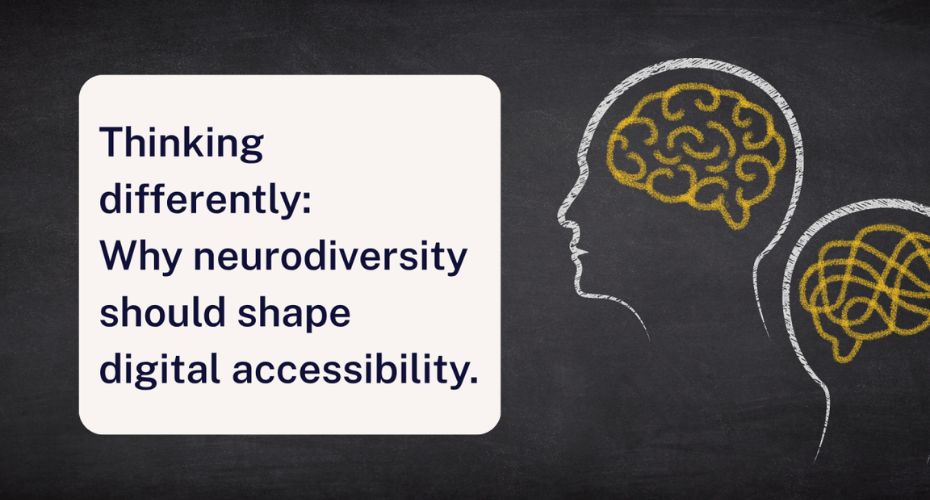
When we talk about accessibility, we often think about physical things like ramps or lifts. But for neurodivergent people, the biggest barriers aren’t physical – they’re cognitive. And a few simple design choices can mean the difference between someone scrolling, or simply clicking away.
We all process websites differently. Some of us scan, some skim, and some focus on images first. For many neurodivergent people, certain design features aren’t just annoying, they can be overwhelming, confusing or even unsafe. And that means they might give up before they find what they need.
Here are some simple ways to design digital spaces that work for everyone.
Keep words simple and clear
Complicated language makes websites harder for everyone, so here are some top tips:
- Use everyday words.
- Avoid jargon.
- If you do need to use an acronym or specialist term, explain it.
Clearer messages keep more people with you.
Give text space to breathe
Large blocks of text look busy. In some of our accessibility audits, we’ve found pages with hundreds of links, images and widgets, risking people feeling overloaded and leaving.
Try breaking things up:
- Shorter paragraphs.
- More white space.
- Fewer distractions.
A calmer page helps people focus.
Use moving images with care
Carousels and animated banners grab attention. But fast movement can be risky for some people, especially those with photosensitive epilepsy. That’s because rapid flashing or quick transitions can trigger seizures, and though this affects a small number of people, the impact is serious.
Some simple rules to help:
- Keep slides on-screen for at least five seconds.
Let people pause, stop or control the carousel.
Avoid high contrast flashing or bright transitions.
If something could make someone unwell, it’s worth rethinking.
Think twice about CAPTCHA
Most of us find CAPTCHAs frustrating. For many neurodivergent people, they’re a real barrier. Whether it’s interpreting distorted text, spotting objects, or following multi-step instructions, CAPTCHAs can make forms impossible to navigate, let alone complete.
Simple alternatives work better, like one step questions (‘Is coal black?’) or basic maths.
We all want secure websites, but accessibility shouldn’t come at a cost.
Reduce digital noise
Too much movement, colour or information makes it harder to focus on what matters. Keep your content concise, break up sections with clear headings, and use images only when they help explain your point.
If the page feels calmer, everyone benefits.
Remember: accessibility is about everyone
When designing online spaces, remember that neurodivergent people may:
- Absorb information differently.
- Need more time to process text.
- Struggle to filter relevant content from distractions.
Good accessibility isn’t about limiting creativity. It’s about designing with empathy, so everyone can use your website.
Take our snapshot test today
Want to see how accessible your website truly is? Try our free snapshot tool for a quick and simple summary. Alternatively, get in touch with us to book an accessibility audit, so you can help your website reach the most people: Accessibility-Services@Shaw-Trust.org.uk