Have yourself an accessible little Christmas
It’s the most wonderful time of the year – or is it?
On the surface, things feel a lot more accessible these days. TV programmes, cinemas and theatre shows often have audio description (AD) for the visually impaired, British Sign Language (BSL) for those who are hard-of-hearing, and relaxed performances for the neurodiverse.
But that’s only part of the story.
For many people with disabilities, navigating Christmas can be as difficult as navigating a winter snowstorm – both in the real world, and the digital one.
O come, all ye inclusive: common accessibility pitfalls
Whether it’s buying presents, seeing a show or booking tickets for travel, there’s a website or app for that! The problem is, not all designed equally. In fact, shockingly, only 3% of the web is accessible.
Imagine shopping on the internet for a special gift, and getting all the way to the payment screen, only to find out the item is out of stock. That’s exactly what it’s like when websites and apps aren’t accessible – the design and functionality can be so poor, that the person can’t finish their purchase.
Or what about trying to choose seats for the Christmas pantomime? If the booking platform hasn’t been designed with assistive technology in mind, the person might not be able to select the right seat or even get to the payment screen.
And as for travel platforms, these typically use web forms to allow people to book tickets in advance. But, some don’t work correctly with screen readers, and features that are designed to be helpful – like auto-completing the station name – can actually cause problems for accessibility.
All we want for Christmas is good design
The scenarios above can just be the beginning, which is why it’s important to think about:
- Headings: These help to break down text and make it easier to follow. If the wrong headings are used, it can affect the ‘flow’ of screen readers and make navigation difficult.
- Contrast: This makes font stand out better against background colours, again helping with reading. Low colour contrast is harder to read.
- Links: These allow for an action – like moving to a different webpage. Buttons with “read more” or “click here” can make it hard to understand where to go.
- Keyboard accessibility: Some people use their keyboard to move around websites, instead of a mouse. Forms, buttons and links should all be selected by keyboard buttons.
Building a user-friendly wonderland
The message is clear: online platforms must do more for those with disabilities – whether it’s optimising them for screen readers, making them accessible by keyboard as well as mouse, or ensuring links logically signpost where to go.
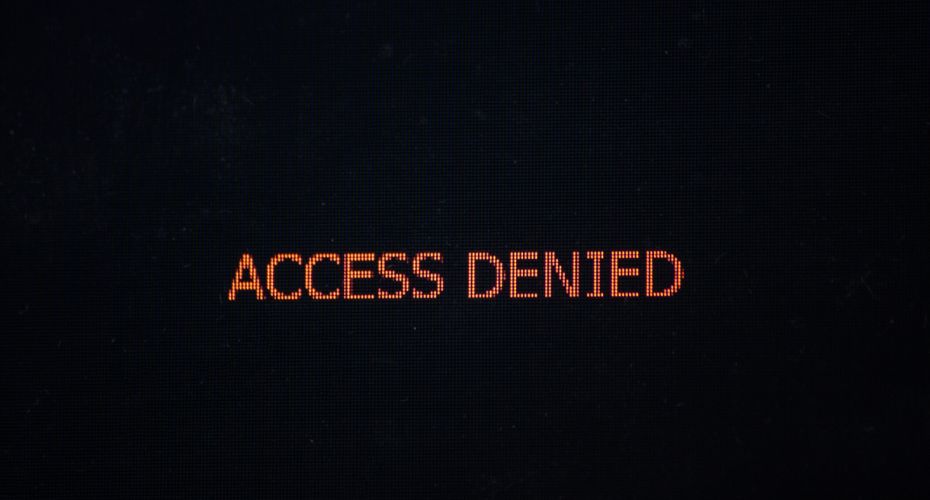
That’s exactly how we help at Shaw Trust, with Accessibility Services that make apps and websites work for everyone – so Christmas is access all areas, not access denied.
Use our free accessibility snapshot tool to see how your website measures up, or get in touch with our team to book a full audit: Accessibility-Services@Shaw-Trust.org.uk
This article has been written in partnership with Accessibility Assessor, Alan Sleat.