This blog on the impact of conveying information using colour alone is a continuation of our series, looking into what comparisons can be made between inaccessible elements on websites, which was inspired by an AXSChat Podcast.
After finishing my original blog, I decided to expand and tell you a bit more about specific areas of assistive technology features that should be used and accessible within a digital platform. This should be the case whether on a website, a document, or any other digital information.
In this specific blog, we discuss why you should not convey Information using only colour.
The Problem With Conveying Information Using Colour Alone
Before I lost my sight, I would not have thought about the fact that some people may not be able to navigate a platform due to the methods used with the use of colour. However, nowadays, with more people using digital technology than ever before, greater considerations need to be made for people who either have colour blindness or visual impairment to successfully direct them on websites to valuable information.
This information will not only assist people who can’t see colours but also the site as a whole, as the use of colours may indicate an important piece of information that many users will miss out on if it isn’t presented in the correct way.
Apart from people highlighting valuable information in a colour, there are also other areas where colours may be used which aren’t providing context for users.
This includes:
Inaccessible Error Messages
I am sure you have made a mistake completing an online form before, and an error message is displayed in red text to highlight each form field that has been filled in incorrectly. If there is no text indicator with the colour, then people who can’t recognise colour will find it impossible to complete this action.
The Use of Colour Making it Difficult To Select Online Items
Sometimes, on a web page, there are answers that need selecting. Often, the choices are highlighted in another colour to indicate when it has been chosen. This can’t be seen by people with a visual impairment.
An example of this would be on a donation page, with the options being £10, £20 or £30. A screen reader user who activates one of these buttons would have nothing indicated to them, leaving them unaware of the amount they have selected to donate. This is due to the amount changing colour instead of having a physical tick box, which would enable everyone to identify the amount they have chosen.
Physical Comparisons of How Valuable Information Should Be Displayed on Websites
The Need to Use Labels As Well As Colours
The underground, as I can remember, has names for each line as well as a colour. This will assist a person with colour blindness. So, adding labels to your content will provide the same outcome.
Giving Directional Details To Aid With Navigation
Your friend has moved to a new house, and they have given you directions to pay them a visit. The only problem is, when you get there, the last direction states, “it is the house with a red door.” This seems like it should be a straightforward direction; however, your friend has not realised that every house has a red door.
Providing another bit of information about the house will back up any issue with other houses having the same colour door. Perhaps giving the number of the house, the type of garden, or the car that will be parked on the driveway, etc. This would be like having an error message where the field is not just labelled in red, giving context and allowing everyone to access that information.
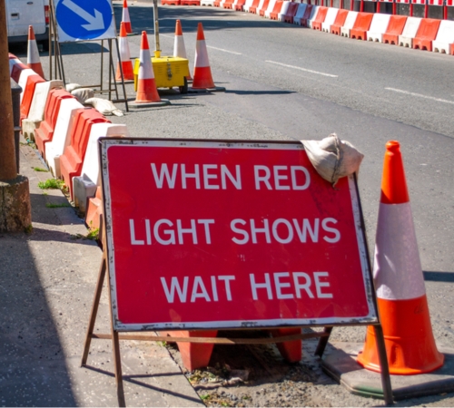
Colour Indicators Which Enables Digital Action
Now, this is an example that everyone has been through, whether as a driver or a passenger: the frustration of road works with temporary traffic lights.
Imagine you are travelling along a long straight road when you come across some road works. These aren’t just any road works, but the ones with temporary traffic lights. These lights are meant to help keep the flow of traffic coming the other way, that you can’t see.
When you pull up to the lights, you realise that they are not working, with no red light to let you know when to stop or green to allow you to go. You are sitting there waiting and there are cars coming past, but now these have stopped:
- Does this mean the lights are now on green?
- Is there just a break in traffic coming the other way?
- Do you risk it or wait a few minutes?
Meanwhile, the cars behind you are beeping their horns. What are you going to do?
You will get past them eventually, but the next time you are meant to be going that way, you may want to find another route.
This is just like a website that uses colours to highlight items, especially with donation forms. People may look to use a different website instead or give their donation to someone else if they can’t easily use the site element.
Eliminating Inaccessible Digital Platforms
I know I have used this last paragraph at the end of each of this series of blogs, but it relays the important message of all the blogs written:
These are just a few comparisons between most people’s everyday life experiences to one of the inaccessible features of digital information in their life. However, there really is no need for any inaccessible areas, as there are always alternatives.
Think about when you could not get access to something. Whether it is in a shop or around your normal life experiences. There is no real reason why you should not be able to gain access. It is usually due to someone having made it inaccessible to you because of the design and not thinking of your individual needs as a customer in a specific situation.
It’s time to make a change and be inclusive.
Over the next few months, I’ll be blogging about ways that you can adapt your websites to achieve digital accessibility and improve the user experience for everyone.
For more details about how we can help with website accessibility testing, please get in touch with our team today.