This blog is a continuation of our new series, looking into what comparisons can be made between inaccessible elements on websites which were inspired by an AXSChat Podcast.
After finishing my original blog, I decided to expand and tell you a bit more about specific areas of assistive technology features that should be used and accessible within a digital platform. This should be the case whether on a website, a document, or any other digital information.
In this blog, we are looking into inaccessible links and labelling features.
How to Correctly Use Links and Labels
When referring to a website address in a web page or document, they are often very long, or the link is found to have a non-descriptive label.
If a web address is used in full, it may take some time to work out which site the URL is actually for. This is especially true when using a screen reader, as the entire web address is read aloud. Instead, giving a descriptive link to either a website address or document will direct the person to their desired page with ease.
For example:
- The Shaw Trust address should be labelled as Shaw Trust and not http://www.shaw-trust.org.uk/. This gives the person the information in an easy-to-read format.
- Another solution would be to make the link descriptive. Instead of writing ‘click here’ or ‘for more information’ the labelling could be Contact the Shaw Trust team.
This is not just a benefit for accessibility, but all site visitors would gain from it as it ensures your digital content will flow better within the text.
Physical Comparisons to Inaccessible Links and Labelling
Example 1
When using factual and reference books, the index operates in the same way as the links on a web page. Each index page is given a descriptive title alongside the page number where it can be found.
Now, imagine the text said, “here 23 turn for more information somewhere near the front of the book.” These directions will not help you find the information you require easily. Just like link labelling on a website, if the link is labelled ‘here,’ a screen reader user would then have to refer back up the page to find out what the link is actually for.
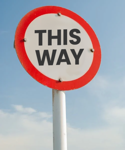
Example 2
If you were driving somewhere and you got to a new roundabout, and the turning sign said ‘this way’ or ‘over there’, which one would you take?
Either you would panic and return home, or you would try to find another route. Alternatively, you might take one of the directions and hope that it is the correct one. If not, you would then have to come all the way back and take the alternative route.
Incorrect or inadequate labelling can be very much like this.
There is No Reason For Inaccessibility
These are just a few comparisons between most people’s everyday life experiences to one of the inaccessible features within digital information in their life. However, there really is no need for any inaccessible areas, as there are always alternatives.
Think about when you could not get access to something. Whether it is in a shop, or around your normal life experiences. There is no real reason why you should not be able to gain access. it is usually due to someone having made it inaccessible to you because of the design and not thinking of your individual needs as a customer in a specific situation.
It’s time to make a change and be inclusive. Over the coming months, I’ll be blogging about ways that you can adapt your websites to achieve accessibility and improve the user experience for everyone.