This blog on website carousels continues our series, looking into what comparisons can be made between inaccessible website elements, which an AXSChat Podcast inspired.
After finishing my original blog, I decided to expand and tell you a bit more about specific areas of assistive technology features that should be used and accessible within a digital platform. This should be the case whether on a website, a document, or any other digital information.
This specific blog features the problems with website carousels for people with disabilities.
What is a Website Carousel?
A carousel is a tool that can give extra information within a page on a website. These often include a short message and striking imagery on each slide. These engaging visuals catch the website visitor’s eye and hopefully encourage and guide the user to find out more about the information or product being displayed. In turn, aiding in keeping the visitor on your site for longer by steering them on a fluent journey through your digital content.
A carousel is a great medium to use on your website, but as always, the correct use of it is so important. In the majority of the other blogs I have written in this accessibility comparison series, some of the areas that I’ve covered explore limitations for some assistive technologies which prevent users from interacting with a platform. And, this feature is no different, an incorrectly programmed carousel can affect so many people when online.
The Problems With Inaccessible Website Carousels
We’ll begin with problems for screen reader users like myself. Due to carousel slides constantly changing, a lot of the time, the cursor jumps from its position each time the slide refreshes. This can cause issues when trying to activate certain website elements, such as if you are on a contact link and ready to activate it when the carousel changes slide and the page jumps, you end up activating the wrong item, like a terms and conditions link in error. This results in a very frustrating experience, as it prevents you from being able to navigate around the website properly. Sliding carousels also present these same issues for keyboard-only users.
Due to the way that some carousels have been coded, the slide’s content is unknown to a screen reader user. On these occasions, sometimes, the information from the slide is presented within the page itself. However, there is no way for the user to know that this is the case. The only way that a screen reader user can find out if what they are reading is the same as the slide’s content or just standard web page information is to see if it changes after the slide moves on to the next one. If it does not change on the web page, a screen reader user cannot access any information within the slide.
How The Speed of Carousels Can Impact On Website Users With Disabilities
If a carousel slide timings are set to change too quickly, then not only does the website visitor not really have a chance to understand or digest the information given, but a more serious problem may occur. You have most likely heard on television about how flashing imagery can affect people who are prone to seizures. This is the same as slides that change too fast and become a blur.
In a way, this also impacts people with cognitive impairments, such as dyslexia and ADHD. When these users are trying to focus on specific important information on a web page, a carousel acts as a distraction, which may also impact their health (although I am not an expert on the effect).
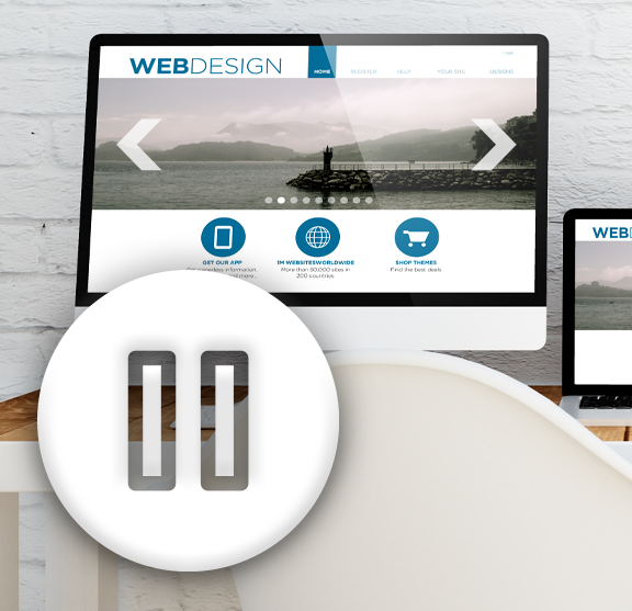
One Simple Way To Make Sure Your Carousel is Accessible
I am guessing most of you will be saying, “I don’t know anything about coding or how to fix this problem”. Well, it is easier than you may think. Simply add a pause button and allow your visitors to be in control.
Adding a pause button will:
- Stop cursors from jumping around the screen.
- Allow yourself to present the information in the same way that you intended.
- Help people concentrate on what is on the screen and not anything moving.
- Enable people to read additional information when they are ready and at the required pace.
An Everyday Comparison of the Effect That Carousels Can Present
For this example, I am going back a few years to when I had sight. There was a time when carousels were being used in conjunction with football scores on Teletext, though I am not sure whether this is still the case nowadays.
This is how I remember it. A football game would be played on the television, and any update on a change in score would be displayed at the bottom of the screen. I suppose we got used to it being at the bottom of the screen, as it did not affect any viewing. However, imagine watching the football, and somewhere on the screen, a score pops up at the top left, bottom right, or somewhere in the middle during the match. How distracting and frustrating would this be for a viewer? Well, this is the same experience that someone with a cognitive impairment finds when accessing a web page that has a moving carousel which they cannot control.
Another example would be with visual displays on trains that display which station and time the train is stopping at next, along with additional information on the upcoming stations. Unless there is also an audio announcement stating the same information, then those details are lost to someone who has difficulty seeing. Saying that the information is given on a screen is great for someone who is Deaf or has low hearing. It’s something many people don’t think about when we hear announcements read out on the train or on a platform.
So, like many of the inaccessible areas on a website, just one simple change, like including a pause button, will solve many problems for many people, enhancing the user experience and enjoyment of reading and interacting with a website.
Eliminating Inaccessible Digital Platforms
I know I have used this last paragraph at the end of each of this series of blogs, but it relays the important message of all the blogs written:
These are just a few comparisons between most people’s everyday life experiences and one of the inaccessible features of digital information in their life. However, there really is no need for any inaccessible areas, as there are always alternatives.
Think about when you could not get access to something. Whether it is in a shop or around your normal life experiences. There is no real reason why you should not be able to gain access. It is usually due to someone having made it inaccessible to you because of the design and not thinking of your individual needs as a customer in a specific situation.
It’s time to make a change and be inclusive.
Over the next few months, I’ll be blogging about ways that you can adapt your websites to achieve digital accessibility and improve the user experience for everyone.
For more details about how we can help with website accessibility testing, please get in touch with our team today.